MapDemand.ai guide
How to generate sales pipeline with territory maps
Most sales teams are not short of data. CRM accounts, customer locations, pipeline reports, and target account lists are all there. What is missing is a clear view of where pipeline could realistically come from next. Rows in a CRM tell you who you sell to. A map tells you where similar demand sits, where your coverage is thin, and where a rep should spend their next hour of prospecting. This guide sets out how sales teams can use territory maps to generate pipeline without over-promising what a map can do.
Why pipeline planning needs a map
Pipeline is a geographic problem long before it is a forecasting problem. Customers cluster. Lookalike accounts cluster near them. Points of interest that match your ideal customer profile cluster too. When that information lives only in spreadsheets and dashboards, reps guess at where to prospect and leaders guess at where coverage is fair. A map removes the guesswork by putting customers, prospects, ICP fit, and territory boundaries in one view.
This matters for the whole team, not only leadership. Reps need to know where to focus to hit their number. Leaders need to see coverage and whitespace across the organisation. Both are answered faster when the data is on a map rather than in a table.
From CRM export to pipeline map in three steps
You do not need a GIS team or a data warehouse to begin. A practical workflow looks like this:
- Upload your sales and customer data. Start with a CRM export that includes customer postcodes or addresses, open pipeline, closed won revenue, sales owner, and territory data.
- Define your ICP and territories. Choose the industries, segments, company sizes, locations, or points of interest that match your sales motion, then group or draw territories on the map. See the how it works section for the full flow.
- Surface pipeline opportunities. Read the map for ICP-fit areas, customer density, and gaps where there is fit but little activity.
Example view: where pipeline opportunity concentrates
The example below shows how opportunity can concentrate in pockets that do not line up with whole-region assumptions. A bright cluster is a prompt to look closer, not a promise of revenue.
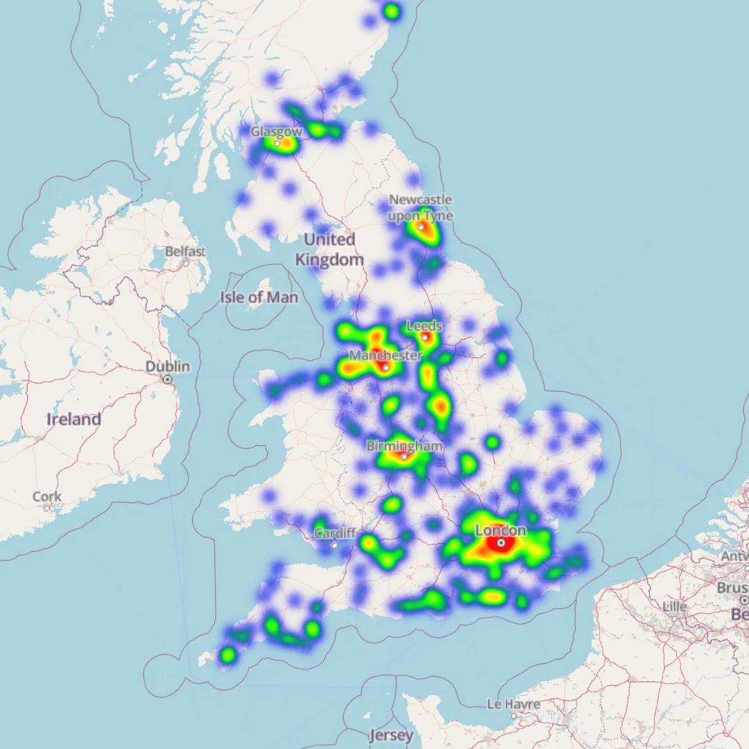
Example maps shown use sample or anonymised data for demonstration purposes.
What to layer on a pipeline map
A single layer rarely tells the full story. Pipeline maps become useful when you read at least two lenses together:
- ICP fit. Areas with a high concentration of accounts that match your ideal customer profile deserve more attention than raw population or footfall.
- Points of interest. Business types and locations that match the customers you already sell to often signal where lookalike accounts sit.
- Customer and prospect density. Where current customers and target accounts cluster, new pipeline is usually easier to build through referrals and local credibility.
- Coverage and whitespace. Strong ICP fit with low activity or no assigned ownership is the clearest pipeline signal of all.
When these lenses agree, you have a strong case for where to prospect, visit, or run a local campaign. When they disagree, the map still earns its place by telling you where to research first.
How AI helps reps decide where to focus
Scanning a map area by area is slow. The point of AI-assisted mapping is to shorten that loop. Instead of manually comparing postcodes, a rep can ask where ICP fit is highest, which nearby points of interest match their best customers, and where a territory is under-covered. The aim is practical prioritisation and research support, not a magic pipeline button. AI suggests where to look and explains why a region looks promising; the prospecting, qualification, and follow-up are still yours.
For sales leaders, the same approach compares territories on coverage, customer density, and whitespace, which makes territory design and rebalancing far quicker than reconciling spreadsheets by hand.
Pipeline questions to ask your map
Once your data is on the map, the fastest way to value is to ask direct questions. A few examples:
- Where should I prospect this week?
- Which areas have the highest concentration of ICP-fit accounts?
- Which points of interest match the customers we sell to?
- Where can I build a new outbound contact list?
- Which territory has the most whitespace?
- Where do we have good fit but no sales activity?
For more prompt-style questions you can adapt to your own data, see the homepage chat with your map section.
Frequently asked questions
How can a map help sales teams generate pipeline?
A map shows where your customers, prospects, ICP-fit locations, and points of interest actually sit, so reps can prioritise where to prospect and leaders can see where coverage and pipeline are missing. It turns CRM rows into a view of where demand may form next.
What sales data do I need to build a pipeline map?
A practical CRM export is enough to start. Useful fields include customer postcodes or addresses, prospect and target account lists, open pipeline value, closed won revenue, sales owner, territory owner, industry, segment, company size, and ICP fields.
Does AI guarantee more pipeline?
No. AI assists with prioritisation and research by suggesting ICP-fit areas, nearby points of interest, and low-coverage territories. It helps your team decide where to focus, but pipeline still depends on your prospecting, qualification, and follow-up.
Is MapDemand.ai available now?
MapDemand.ai is in early access and is being built for sales teams. You can join the waitlist to test pipeline mapping, ICP targeting, and territory views as releases open, and to help shape what we build next.
Get early access to MapDemand.ai
If you want pipeline, ICP, and territory views on your own CRM and sales data, join the waitlist and help shape the first release.